
![ApptioCareers-Employee[1]](data:image/svg+xml;base64,PHN2ZyB4bWxucz0iaHR0cDovL3d3dy53My5vcmcvMjAwMC9zdmciIHZpZXdCb3g9IjAgMCAyMjUgMjc1IiB3aWR0aD0iMjI1IiBoZWlnaHQ9IjI3NSIgZGF0YS11PSJodHRwcyUzQSUyRiUyRnd3dy5hcHB0aW8uY29tJTJGd3AtY29udGVudCUyRnVwbG9hZHMlMkZlbGVtZW50b3IlMkZ0aHVtYnMlMkZBcHB0aW9DYXJlZXJzLUVtcGxveWVlMS1xZzVuenB5MHdoaWJtbzZvdmJqNGM3MHh0aTUzdmo1OHM0endwajh0dHMucG5nIiBkYXRhLXc9IjIyNSIgZGF0YS1oPSIyNzUiIGRhdGEtYmlwPSIiPjwvc3ZnPg== "ApptioCareers-Employee[1]")
Why bother with charts and graphs?
When you have a presentation to give to the board or a new sales document that you want to put out into the world, it’s usually expected that you’ll break down the information with some colors and maybe a pie chart or a bar graph. It’s a way to condense information and, in theory, make it easy to read and digest. If nothing else it makes everything look nice.
The benefits of visualizing data are clear, but do you visualize information in day to day work? Visualizing your team’s work can do more than make your meetings more colorful. There are plenty of opportunities to make your team’s work more transparent and improve communication within your team with visual representation. In fact, there are many benefits of visual management, along with tools like Targetprocess to help you take advantage of them.
How does the science of visual management benefit your team?
Author Tom Wujac explains in this presentation how your brain creates meaning by using images to clarify ideas, how it interacts with those images to create engagement, and augments your memory with persistent and evolving views. The implication of Wujac’s ideas can be felt in the way we discuss the science of visual management.
Visual management can benefit your team by providing context for your work, clearly presenting your team’s progress and pointing out where improvements can be made, and helping to break down complex ideas into easy to understand symbols that can be used to tell a story clearly.
1. Providing context is one of the key benefits of visual management
A primary benefit of visualizing data is that it simplifies communication and makes it easier to understand and relate to. In a presentation, a simple line graph that shows declining revenue provides the background information that supports an argument to develop a new initiative. The graph can be supported by important “at a glance” data points rather than a dense paragraph of text.
The same principle can work in your sprint planning. Visualizing time on a graph, and the work that is budgeted within that time, becomes more tangible and less abstract. It can convey all team members tasks and what is happening across the team, keeping everyone on the same page about what needs to be done. It can also help keep work transparent as progress moves forward.
And when looking back on the work you’ve done in your past sprint, data visualization can help provide insight into how time was spent. It can also help to spot unseen connections and patterns. Trends that may have been missed, budgets that got out of control, and tasks that took longer than expected are easier to spot in a visual report than they would be otherwise.
2. Visualizing progress
Sure, it may sound intuitive, but a major benefit of visual management is being able to see what everyone on your team is working on, and how work is progressing. Is there a task that is blocked because you’re waiting for another task to be completed? Is there something that needs to be prioritized? When almost all of the work done in your office is done on individual computers, it can be hard to have a sense of where your team is at on any given project, or what may be the most efficient way to proceed.
If you’re considering Agile, visual management is especially helpful. In the midst of a two-week sprint, a visual map of progress will help you quickly figure out what is and isn’t working. If a task on the timeline is stuck in place, it is much easier to see where adjustments need to be made and make them on the fly. A timeline view, like the one in Targetprocess, can show you what tasks everyone on your team is working on and how close they are to being done.
When your team can see everyone’s progress, it also makes it easier to communicate. When the process of finishing tasks during a sprint is transparent to everyone, the need to have meetings for the sole purpose of keeping everyone on the same page is reduced. If a problem or block arises, it’s visible to the whole team and solving it can be made a priority without also requiring a discussion among various team members first.
There are a number of ways that progress can be visualized, and different ideas need different visual representations. The progress a team makes when working together is a kind of story, and there are different ways in which that story can be told.
3. Breaking down key ideas with visual tools
Visual management is about more than just putting data in charts, it is about isolating important information and making it easier to see trends that would get buried if left purely as statistics. We’ve discussed it on the blog here before, but it’s worth looking at again. Understanding data types and variables will help you process information visually and tell exactly the kind of story you want to tell.
Quantitative data is anything that has exact numbers, like duration in days. Qualitative data, like user story priority or bug severity, can be compared and ordered. Everything else is categorical.
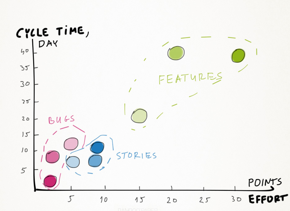
When you are setting out to organize that data on a graph, it can be split up into a number of graphic types. Size, texture, shape, orientation, color value and hue are all tools at your disposal for making your data clear and concise. By putting all of your variables together you can build a chart that bugs, stories, and features plotted over an X and Y axis of time and effort. By breaking down the elements even further with different sizes and color hues to denote importance, you can lay out an entire sprint in an easy to understand image that is easy for your team to refer to.
Visual management and Agile
The benefits of visual management for an Agile team come from the ability to see trends and progress quickly, and to build that into your team’s workflow. Rather than waiting until the end of a project to turn data into graphs and charts, working with visual management throughout the process will help you keep your team on the same page while providing clear, transparent information.


